21 Fascinating Infographics About the World We Live In
Our society ... as told by the numbers
Published 1 year ago in Wow
Though the world is filled with numbers, they're hard for our human brains to wrap around. What, exactly, does a million look like? How big is a mile? Does "eight inches" really have that broad of a definition?
Thankfully for our numerically challenged mind's eyes, infographics are here to save the day, helping us digest big data in a way that actually makes sense.
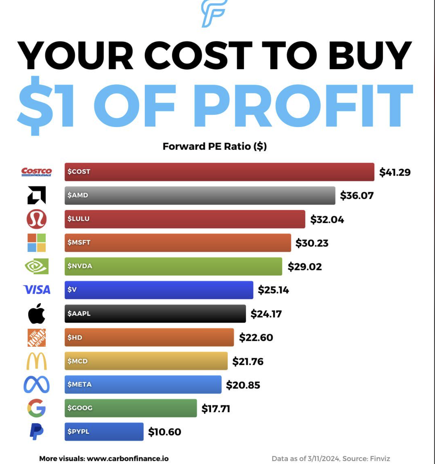
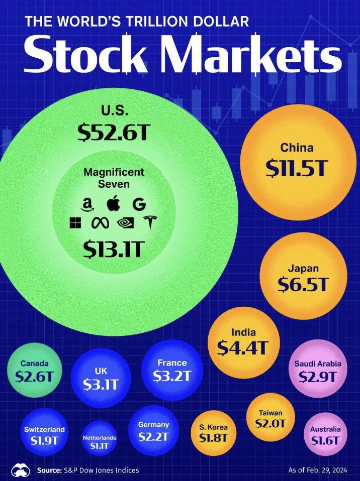
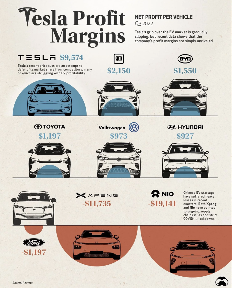
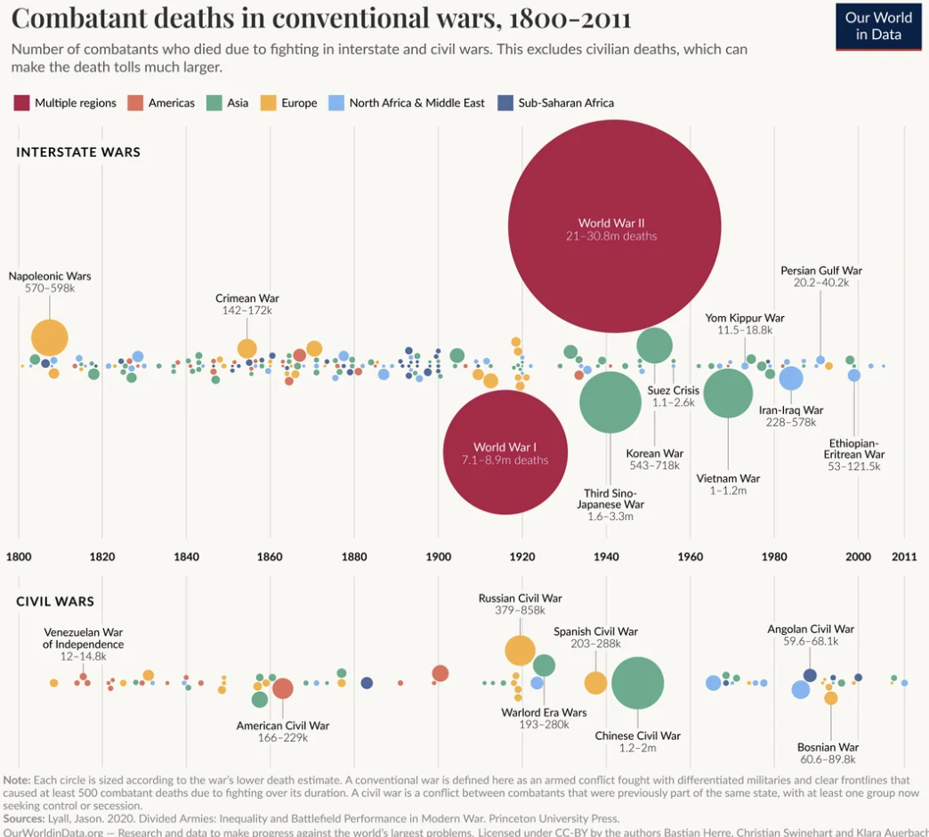
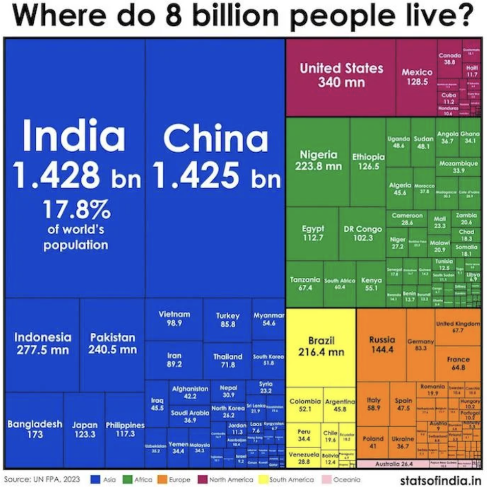
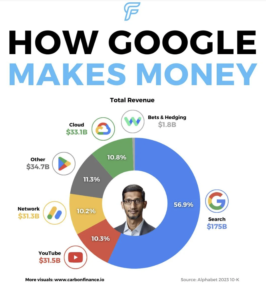
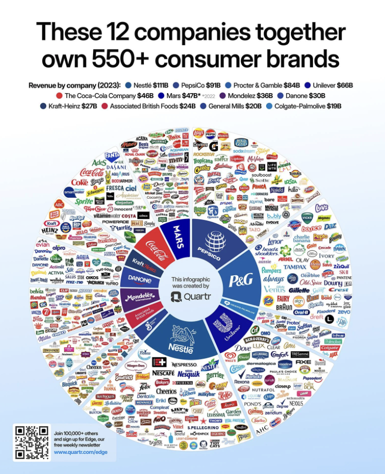
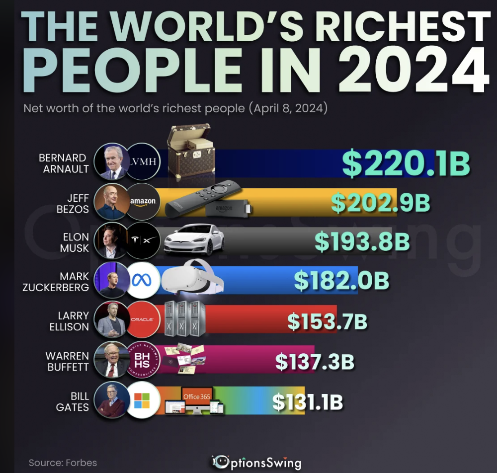
From the shocking power of conglomerates to how, exactly, Costco has gotten away with keeping their hot dog and drink combo at a steady $1.50, here are 21 fascinating infographics about the world we live in.


Most Popular