Branding is one of a company's most powerful tools. It shapes identity, builds trust, and creates an emotional connection with customers. A strong brand instantly communicates values and personality, often becoming as recognizable as the product itself.
But when companies try to update or modernize their look, things don’t always go as planned. Rebrands that ignore customer loyalty, heritage, or clarity can spark backlash, confusion, and even financial losses. Something meant to refresh a brand instead feel like a betrayal, making it harder for audiences to relate.
These moments remind us that branding isn’t just about logos or colors, it’s about the bond between a company and the people who believe in it and how that bond can break just as easily as it was built.
1
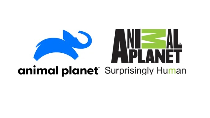
Animal Planet
They ditched away the iconic clunky M and went back to the elephant imagery, some fans weren't pleased.
2
Gap
Six days. That’s how long this generic ‘PowerPoint logo’ lasted before the brand scrapped it and returned to its classic blue box.
3
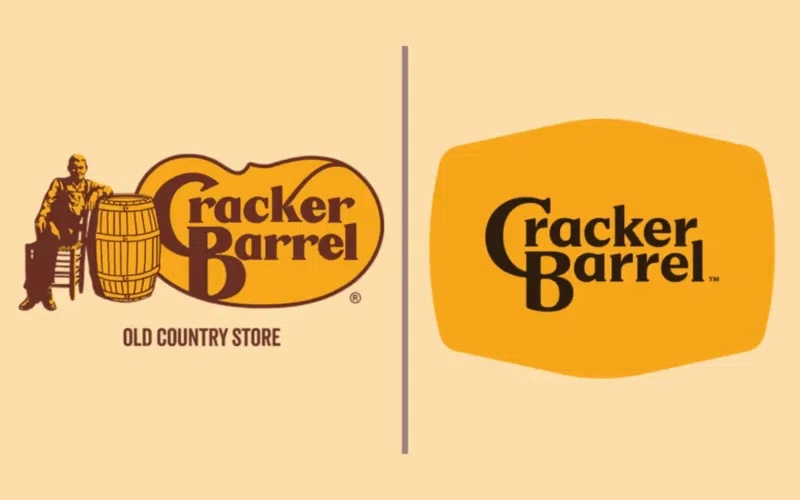
Cracker Barrel
From cozy nostalgia to sterile minimalism, customers said the soul got stripped out along with the barrel. Backlash was so fierce, the company quickly restored the old logo.
4
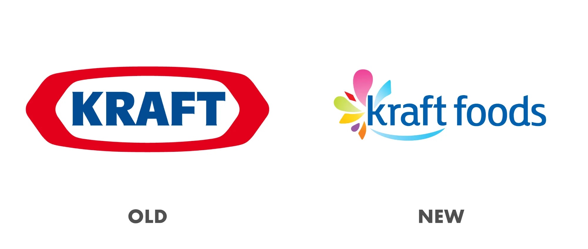
Kraft Foods
Went from bold and timeless to rainbow swoosh confusion, looked more party supplies than pantry staple. The company quietly reverted after the flop.
5
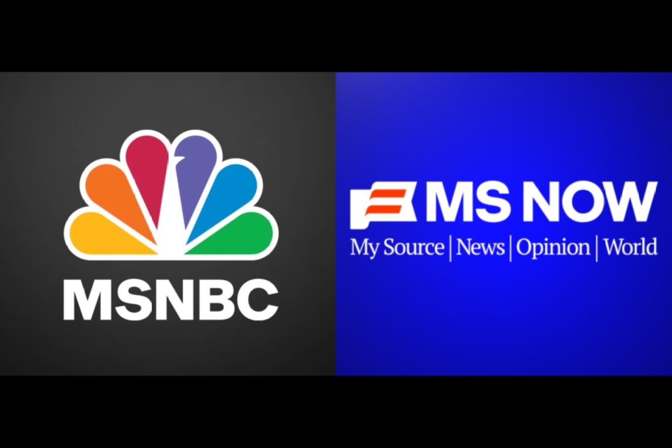
MSNBC to MS Now
Decades of recognition swapped for a name that sounds like a bad news app. Too fresh to say if they’ll cave, but audiences aren’t buying it.
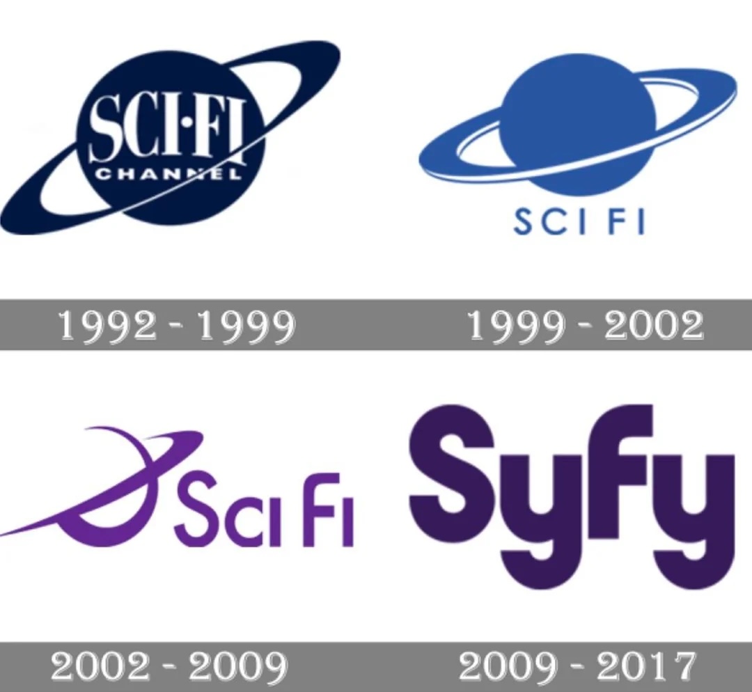
6
Sci-Fi to SyFy
When spelling gimmicks outshine clarity, fans feel alienated, literally. Despite criticism, the network kept it.
7
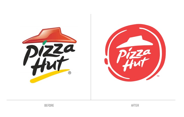
Pizza Hut
From appetizing and playful to stamp-like and flat, customers said it lost its flavor. The brand brought back its retro logo in 2019 after years of pushback.
8
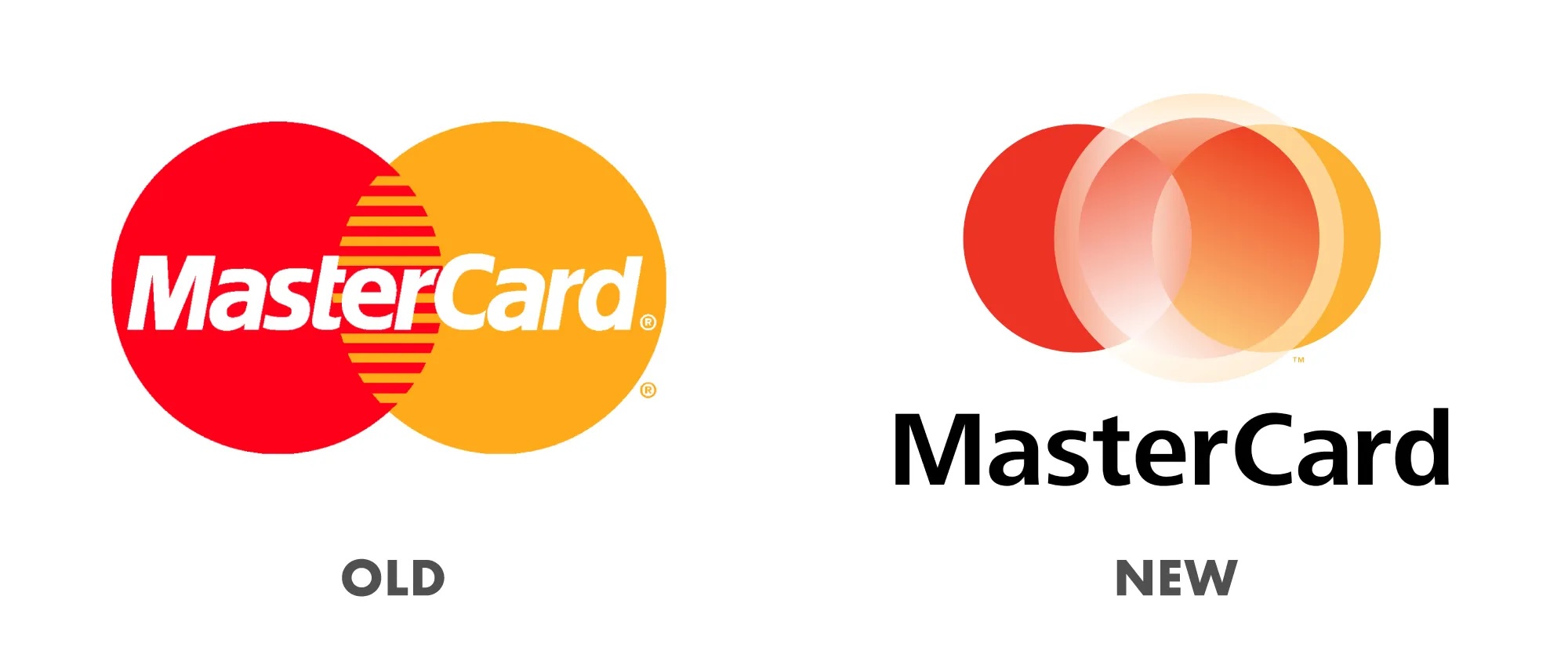
Mastercard
Minimalism gone too far, critics said the iconic overlap lost its punch and personality. Unlike others, Mastercard stuck with it.
9
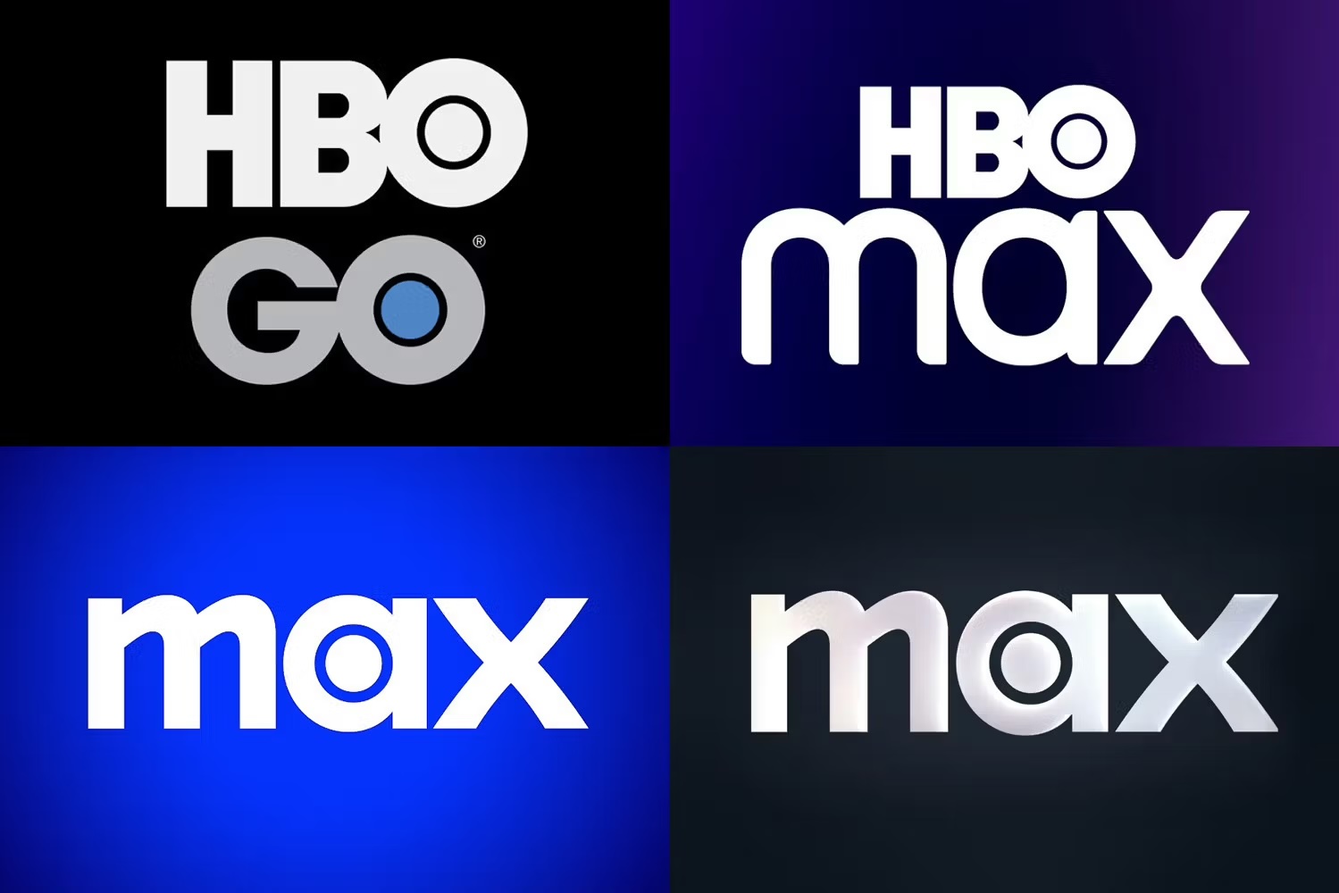
HBO
Dropping HBO for a bland ‘Max’ felt like trading diamonds for glass. Backlash forced the brand to wobble, sometimes bringing HBO back, sometimes not, showing they’re still unsure.
10
JCPenney
Boxy and lowercase, the redesign felt cold at a time when shoppers craved comfort.
11
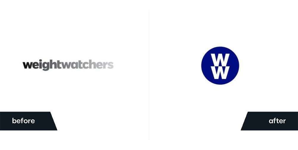
Weight Watchers to WW
Two letters, no meaning. Critics said the brand lost its story along with its name. The company still uses WW, but the rebrand never gained traction.
12
Twitter to X
Killing the bird for an ‘X’ wiped out one of the most iconic logos of all time overnight. Elon shows no signs of reversing, despite global criticism.
13
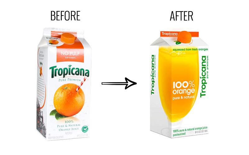
Tropicana
New packaging so bland shoppers couldn’t spot it on shelves, sales plummeted 20%. Within two months, they brought back the old carton.
14
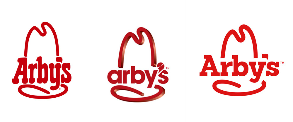
Arby’s
3D, lowercase, awkward, fans missed the bold cowboy-hat confidence. The brand soon revived a cleaner version of the hat design.
15
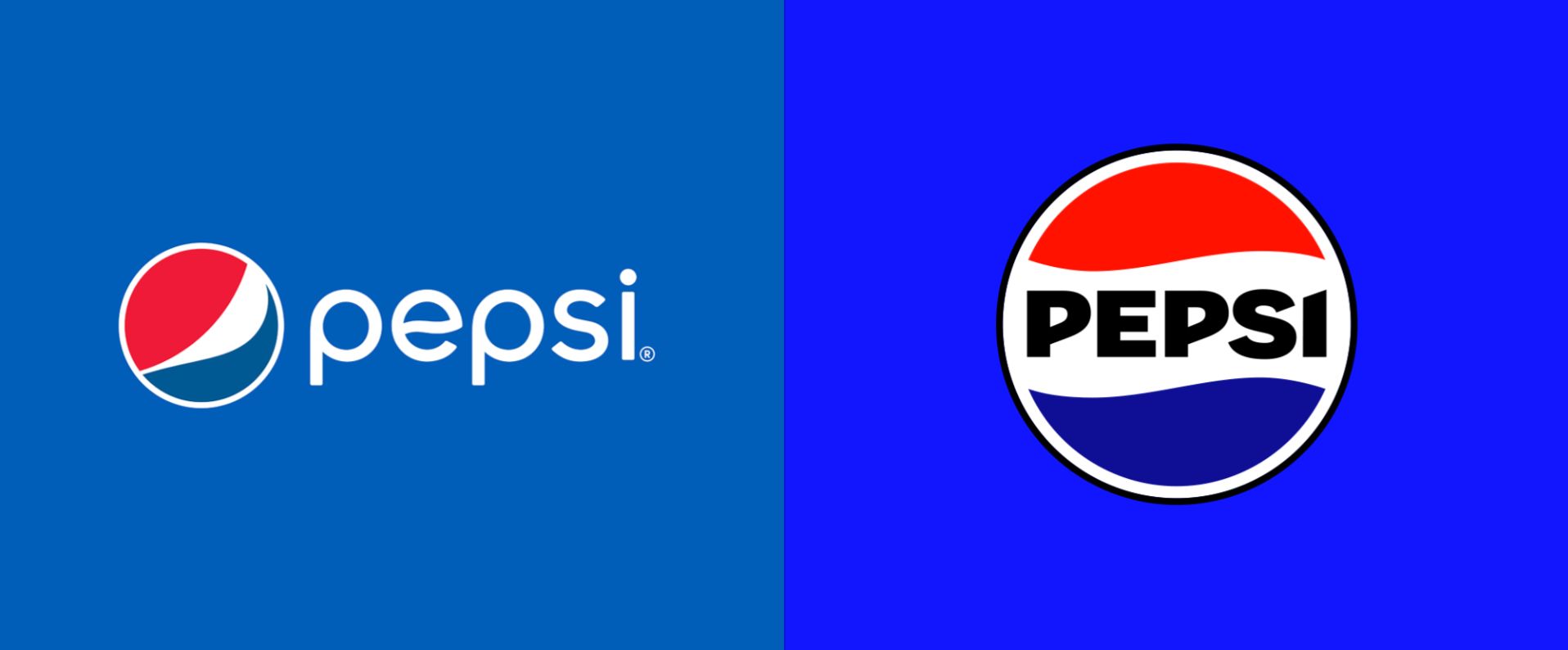
Pepsi
A million-dollar redesign mocked as a weird smiley face, proof that overthinking kills clarity.